Month 3, Day 52 - 36-month forex trading challenge - the market mode.
I've made somewhat of a breakthrough I think today in how I view the market, in order to help me decide on the most appropriate strategy to use.
Any currency pair moves in one of three directions – up, down or sideways. In trading speak this is usually referred to as bullish, bearish or range / consolidation.
When I started out in forex trading I regularly applied the wrong strategy to the wrong market. Trying to play a range in a trending market just doesn't work and the same goes for the opposite. Through experience I learnt that identifying what I call the correct 'market mode' is critical to my success.
As part of my daily market analysis I look to determine whether the market is displaying bullish, bearish or range characteristics. The majority of trading books explain that bullish price action consists of a series of higher highs and higher lows, while bearish characteristics consist of lower lows and lower highs. A ranging market lacks clear direction with price bouncing back and forth between two horizontal extremes of support and resistance.
Consistency in trading is important and how I interpret the market today should be the same as how I interpret the market tomorrow, and on all subsequent days. My analysis of price in relation to the 200 and 50 SMAs is 100% consistent. It's very easy to see whether price has closed above or below a given SMA – there's no need for interpretation.
However, in relation to an assessment of market mode, despite the definitions provided by textbooks, when it comes to interpretation of a living, breathing, moving market – things are often less clear.
This has troubled me for a while and this morning I finally came up with a clear definition of what I view as bullish and bearish price action. The screenshots from my charts below help explain my approach and will hopefully help with your own personal interpretation of market mode, whatever market you trade.
For me it's less important what criteria I choose to use to determine the market mode. What really matters is that the method I've chosen enables me to make decisions that remain consistent over time.
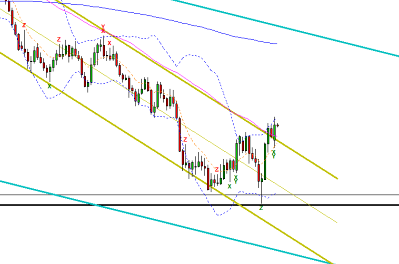
GBPUSD >
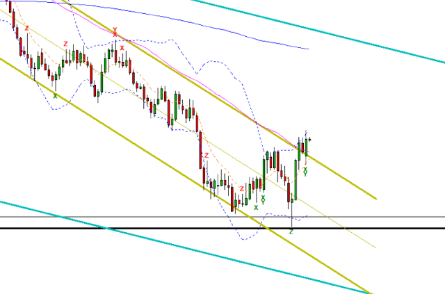 Above the price action in GBPUSD has been bearish displaying a series of lower lows and lower highs encapsulated by my daily trend line drawn in gold. What I'm always interested in is when a market turns from BEARISH mode to BULLISH mode and vice versa. In the chart below you can see that this is exactly what's happened in GBPUSD, visually identified by the upward trend line.
 But how did I determine this change in market mode?
Well before it was down to my discretion, but now is determined by clear and consistent rules. The following two criteria must be met:
The bonus here is that this change in market mode occurred at what I call a SIG. LEVEL 1 (a 10, 5 or 3-year low), and that the final low failed to close below the preceding low (a new low was not forthcoming).
The same rules work in reverse for a change from BULLISH mode to BEARISH mode:
To drive the point home, here are some other examples with accompanying notes below.
EURUSD >
 In EURUSD above we see a lower low, and no close above the preceding high. This market remains in BEARISH mode for the time being, and must close above the dashed brown line and the 50 SMA for the market mode to change.
AUDUSD >
 In AUDUSD above we see a failed attempt at a lower low, but a close above the high preceding the most recent low. As price has failed to close above the 50 SMA however, this market remains in BEARISH mode. A close above the 50 SMA would see a move to BULLISH mode.
The above is probably the hardest of all the charts to decipher, because it could be argued that the prior high is the one intersecting the weekly trend line (turquoise line). However I treat consolidating price action as a prior high when a new low has failed to transpire.
USDCAD >
 In USDCAD above we can see an example of changing market modes.
BEARISH to BULLISH > price closed above the YX (highlighted / dashed brown line) candle, but the mode did not turn BULLISH until the close beyond the 50 SMA.
BULLISH to BEARISH > price closed below the preceding low (highlighted wick / dashed brown line), but the mode did not turn BEARISH until price closed below the 50 SMA.
Note, again (as with AUDUSD above) the consolidating price action. Here I treat consolidating price action as a prior low when a new high has failed to transpire.
EURGBP >
 In EURGBP above, although price has closed below the 50 SMA, it has yet to close below the low preceding the most recent high (dashed brown line). For the time being this market remains in BULLISH mode.
GBPJPY >
 Finally, in GBPJPY above price has entered BULLISH mode. The high preceding the most recent low has been closed above along with the 50 SMA. As a bonus the most recent low failed to close below the prior low and the change in mode occurred just north of a SIG. LEVEL 1.
So there you have it – clear and consistent rules to identify a BULLISH or BEARISH market mode, which will now be added to my trading plan.
I should mention that my interpretation of market mode occurs on the daily chart. As I'm usually in trades from a few days to a few weeks, this in my view is the most relevant time period for me to gauge the current bias in any given currency pair. I also consider the weekly chart, but this is primarily for potential turning points, and the 240 chart is my execution time frame, which provides my entry and exit signals.
For completeness I should probably take a moment to clarify what constitutes a RANGE mode. Well here you have it:
On the daily chart >
On the 240 chart >
That's probably enough for one blog post. As a quick update on trades, I entered shorts in AUDCAD (T39S) and AUDNZD (T40S) this morning, and will update on these tomorrow and in week 11's video, which once published you'll be able to find on the STG FOREX TV YouTube channel.
Is it really possible to turn £50K into £1M? Over the next 36 months I'm going to find out by trading my personal account with full transparency.
Follow my 36-month challenge to turn £50K into £1M.
Read my blog here: https://stgforextvforexchallenge.blogspot.com
Subscribe on YouTube here: https://www.youtube.com/channel/UCyGySJ5IeDjq-DIJPU7nYvw
[Please note, the information presented is general educational material and does not constitute trading advice.
Trading foreign exchange (forex) on margin carries a high level of risk and may not be suitable for you or your circumstances.
Before trading forex you should investigate all of the risks, including the possibility that you could lose more than your initial investment.
It’s important to consider your investment objectives, level of experience and risk appetite. If in doubt seek advice from an independent financial advisor.]
Any currency pair moves in one of three directions – up, down or sideways. In trading speak this is usually referred to as bullish, bearish or range / consolidation.
When I started out in forex trading I regularly applied the wrong strategy to the wrong market. Trying to play a range in a trending market just doesn't work and the same goes for the opposite. Through experience I learnt that identifying what I call the correct 'market mode' is critical to my success.
As part of my daily market analysis I look to determine whether the market is displaying bullish, bearish or range characteristics. The majority of trading books explain that bullish price action consists of a series of higher highs and higher lows, while bearish characteristics consist of lower lows and lower highs. A ranging market lacks clear direction with price bouncing back and forth between two horizontal extremes of support and resistance.
Consistency in trading is important and how I interpret the market today should be the same as how I interpret the market tomorrow, and on all subsequent days. My analysis of price in relation to the 200 and 50 SMAs is 100% consistent. It's very easy to see whether price has closed above or below a given SMA – there's no need for interpretation.
However, in relation to an assessment of market mode, despite the definitions provided by textbooks, when it comes to interpretation of a living, breathing, moving market – things are often less clear.
This has troubled me for a while and this morning I finally came up with a clear definition of what I view as bullish and bearish price action. The screenshots from my charts below help explain my approach and will hopefully help with your own personal interpretation of market mode, whatever market you trade.
For me it's less important what criteria I choose to use to determine the market mode. What really matters is that the method I've chosen enables me to make decisions that remain consistent over time.
GBPUSD >

Well before it was down to my discretion, but now is determined by clear and consistent rules. The following two criteria must be met:
- Price has closed above the high preceding the most recent low.
- Price has closed above the 50 SMA.
The bonus here is that this change in market mode occurred at what I call a SIG. LEVEL 1 (a 10, 5 or 3-year low), and that the final low failed to close below the preceding low (a new low was not forthcoming).
The same rules work in reverse for a change from BULLISH mode to BEARISH mode:
- Price has closed below the low preceding the most recent high.
- Price has closed below the 50 SMA.
To drive the point home, here are some other examples with accompanying notes below.
EURUSD >

AUDUSD >

The above is probably the hardest of all the charts to decipher, because it could be argued that the prior high is the one intersecting the weekly trend line (turquoise line). However I treat consolidating price action as a prior high when a new low has failed to transpire.
USDCAD >

BEARISH to BULLISH > price closed above the YX (highlighted / dashed brown line) candle, but the mode did not turn BULLISH until the close beyond the 50 SMA.
BULLISH to BEARISH > price closed below the preceding low (highlighted wick / dashed brown line), but the mode did not turn BEARISH until price closed below the 50 SMA.
Note, again (as with AUDUSD above) the consolidating price action. Here I treat consolidating price action as a prior low when a new high has failed to transpire.
EURGBP >

GBPJPY >

So there you have it – clear and consistent rules to identify a BULLISH or BEARISH market mode, which will now be added to my trading plan.
I should mention that my interpretation of market mode occurs on the daily chart. As I'm usually in trades from a few days to a few weeks, this in my view is the most relevant time period for me to gauge the current bias in any given currency pair. I also consider the weekly chart, but this is primarily for potential turning points, and the 240 chart is my execution time frame, which provides my entry and exit signals.
For completeness I should probably take a moment to clarify what constitutes a RANGE mode. Well here you have it:
On the daily chart >
- Bollinger bands are flat and parallel (not expanding or contracting).
- Price touches support / resistance at least two times either side to confirm the existence of a RANGE.
- The 50 SMA and 200 SMA are either relatively flat down the middle of the RANGE or exist at the extremes of the Bollinger bands.
On the 240 chart >
- The 50 SMA and 200 SMA are either relatively flat down the middle of the RANGE or exist at the extremes of the RANGE.
- Price fails to respect the 50 SMA and 200 SMA for any length of time.
That's probably enough for one blog post. As a quick update on trades, I entered shorts in AUDCAD (T39S) and AUDNZD (T40S) this morning, and will update on these tomorrow and in week 11's video, which once published you'll be able to find on the STG FOREX TV YouTube channel.
*********
Is it really possible to turn £50K into £1M? Over the next 36 months I'm going to find out by trading my personal account with full transparency.
Follow my 36-month challenge to turn £50K into £1M.
Read my blog here: https://stgforextvforexchallenge.blogspot.com
Subscribe on YouTube here: https://www.youtube.com/channel/UCyGySJ5IeDjq-DIJPU7nYvw
[Please note, the information presented is general educational material and does not constitute trading advice.
Trading foreign exchange (forex) on margin carries a high level of risk and may not be suitable for you or your circumstances.
Before trading forex you should investigate all of the risks, including the possibility that you could lose more than your initial investment.
It’s important to consider your investment objectives, level of experience and risk appetite. If in doubt seek advice from an independent financial advisor.]

Comments
Post a Comment